


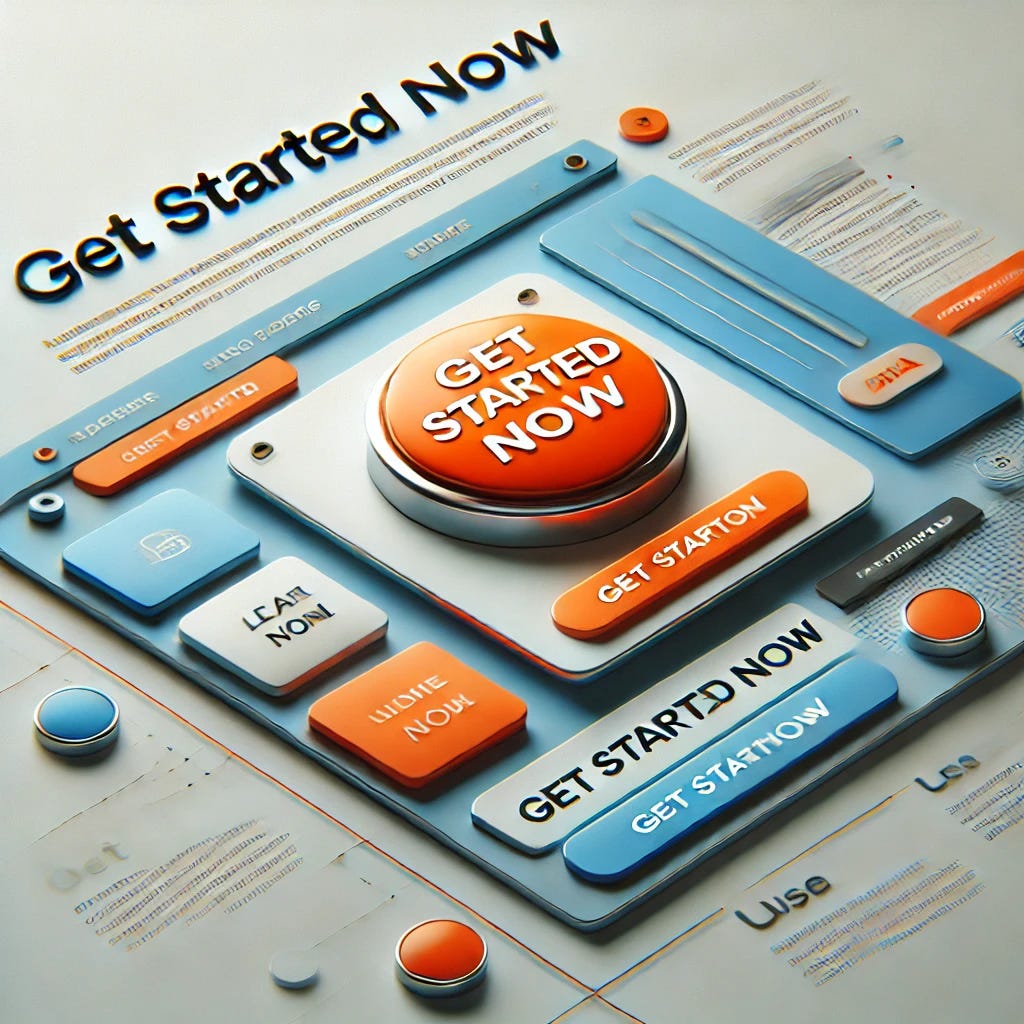
6 Easy Steps to Make Highly Effective CTA Buttons
Crafting Call-to-Action Buttons That Drive Engagement

CTA (Call-to-Action) buttons play a pivotal role in driving user engagement and conversions on websites and marketing campaigns. A highly effective CTA button not only guides users toward taking the desired action but also increases your chances of achieving business goals. Let’s explore six easy steps to make CTA buttons that work like a charm.
Step 1: Choose Clear and Actionable Text
The text on your CTA button should tell users exactly what to do. Clarity is key to avoiding confusion and guiding visitors toward the desired action. Actionable text ensures that users are compelled to take the step you want them to take. Use power words like “Start,” “Try,” “Get,” or “Claim.”
Why Clarity Matters
When users land on your page, they’re looking for directions. Ambiguous or generic CTA text like “Click Here” doesn’t tell users what they’re getting or doing. In contrast, a button like “Get Your Free Trial” or “Download the Guide” directly communicates the benefit of the action.
How to Optimize the Text
Use concise language and make the action sound enticing. Focus on benefits over features. For example, instead of saying “Subscribe,” try “Get Updates That Matter.” Avoid overly complex words or jargon as they can intimidate or confuse potential users.
Testing is Crucial
Conduct A/B testing on different variations of CTA text. Even small tweaks, such as changing “Submit” to “Get Started,” can result in noticeable improvements in conversion rates.
Step 2: Make the CTA Stand Out Visually
The design of your CTA button determines whether it catches a user’s attention. To be effective, it should visually pop out from the rest of the page.
Use Contrasting Colors
Contrasting colors ensure your CTA button doesn’t blend into the background. Choose colors that align with your branding but create enough contrast to stand out. For instance, if your website predominantly uses blue and white, consider using an orange or green button.
Focus on Size and Shape
Size matters when it comes to visibility. A CTA button should be large enough to grab attention without overpowering the content. Similarly, rounded edges or slight gradients can make the button look more clickable and inviting.
Placement is Key
Strategic placement of the button can also increase conversions. Place your CTA above the fold and repeat it at natural stopping points, like at the end of a product description or after a testimonial.
Step 3: Create a Sense of Urgency
Urgency is a psychological trigger that motivates users to take action quickly. When people believe they might miss out on something valuable, they’re more likely to act.
Use Time-Sensitive Language
Incorporate phrases like “Limited Time Offer,” “Expires Soon,” or “Only 5 Left in Stock.” This conveys a need to act immediately and removes hesitation.
Leverage Fear of Missing Out (FOMO)
FOMO can be effectively used to nudge users into action. For example, buttons like “Claim Your Spot Before It’s Gone” or “Save Your Seat Now” create a compelling reason to act.
Avoid Overusing Urgency
While urgency can boost clicks, overusing it can lead to mistrust. Be authentic and only use urgency when there’s a real reason to do so.
Step 4: Optimize for Mobile Users
Mobile users account for a significant portion of web traffic, so your CTA buttons need to be mobile-friendly.
Ensure Responsiveness
Responsive design ensures your CTA button adapts to various screen sizes. It should remain large enough to click easily without accidental touches on smaller devices.
Make It Thumb-Friendly
Design your button with mobile ergonomics in mind. Place it within easy reach of a user’s thumb, typically in the lower center or bottom right of the screen.
Test Across Devices
Regularly test your CTA buttons on multiple devices and browsers to ensure they perform seamlessly, regardless of the platform.
Step 5: Use Persuasive Microcopy
Microcopy refers to the small text around or within a CTA button that gives additional context. Well-written microcopy can reassure users, clarify their next step, or make the offer irresistible.
Clarify What Happens Next
Add text that explains what users can expect after clicking. For example, below a “Sign Up” button, you could include “It only takes 2 minutes!” or “No credit card required.”
Address Objections
Use microcopy to reduce user hesitation. For instance, under a “Download Now” button, include “Your email is safe with us.” Reassurance can build trust and improve conversion rates.
Stay On-Brand
Ensure the tone of your microcopy aligns with your brand’s voice. A quirky brand might write, “Let’s Get This Party Started,” while a more formal one could say, “Begin Your Free Trial Today.”
Step 6: Test and Analyze Performance
No matter how well you design your CTA buttons, there’s always room for improvement. Regular testing and analysis are essential to optimize performance.
A/B Testing
Experiment with different button text, colors, shapes, or placement. Monitor which variations yield the best conversion rates. For example, test whether “Buy Now” or “Shop Now” resonates more with your audience.
Use Analytics Tools
Utilize tools like Google Analytics or heatmaps to understand user behavior. These insights help determine if users are clicking the CTA as intended or if there are issues with visibility or placement.
Iterate Based on Feedback
Customer feedback and testing data should guide your iterations. Continuously improve your buttons to meet user expectations and adapt to changing trends.
Creating highly effective CTA buttons doesn’t have to be complicated. By implementing these six easy steps, you can design buttons that not only look appealing but also inspire action. Remember, clarity, visual appeal, urgency, mobile friendliness, persuasive copy, and regular testing are the keys to CTA success.
Visit our website for more information: Early Bird Labs